A gender specific object is an object which was designed specifically for a certain gender with a lot of different things taken into consideration such as the colour, over all shape of the object, and details. generally objects designed solely for women are more curvy and detailed, whereas for men it is more practical. This is due to the fact that for hundreds of years men are considered the dominant species and want to show power and that they are capable of getting a lot done, whereas stereo typically women are thought to be more about appearance, vanity and beauty and impressed by trivial features such as feminine names and soft designs. Examples of this can be seen with razors.
This is a typical razor designed for a female. Pink is seen as a typical female colour and the packaging is curved, showing innocence. The name Venus is named after a goddess which was the significance of beauty so targets women who believe that this will make them more physically appealing than other products.
Whereas in comparison, the razors targeted towards men are completely aesthetically different. This razor is named Fusion Pro-Glide which is a much more technical name that suggests it works much efficiently than others and is more advanced than female products. The colour is a meetallic blue and black which are stereo typically seen as much more masculine colours than the female product which is pink. As well as this the box shape is more square, angular and sharp which implies more aggression and testosterone fueled than that of a soft and curvy looking package. Finally the text on the product says 'POWER' in bold capital letters which have nothing in particular to do with the overall product but adds to the appeal for a man because of their inbuilt alpha male hormones that want to be strong and powerful.
Another example of a gender specific object is deodorant body sprays, as they both are advertised in different ways. Primarily masculine sprays are designed to make girls view the male in a sexual and many way, whereas with women it is to be seen in a more romantic and innocent way.Examples can be seen below.
Lynx is one of the leading brands in deodorant for men due primarily to different advertising methods amongst different medias, on their adverts they use humour to over sexualise men after using the product and due to the humour audiences share the videos and talk about it on social networking sites so knowledge about the products get around fast, and because of the males in the advertisements being seen as very sexual it makes the buyers of the product believe that it could be them in that situation. The overall style of the product is very masculine due to claw marks which suggest ruggedness and relates to barbaric times when men were at their most masculine and strong. The black colour and overall shape gives a kind of go faster stripe that makes it seem more advanced than the generic cylindrical shape of a normal spray bottle also, and even the metallic colours used in text give a steel and masculine impression of danger.
Completely different than the masculine deodorant is the females, the first major difference is the shape of the product, being cylindrical with very little angles and mainly curved it sticks to the overall design that it was designed to be aesthetic rather than technical and efficient. The image on the deodorant canister is of a flower which is associated with beauty and femininity, and being pink sticks to the colour scheme which is thought of for women, and the text saying very pink adds to that.
This piece of art work is by a online artist who takes commisions by people over facebook and uses paint to recreate humorous suggestions made by fans, this piece is of Brian Blessed punching a polar bear, and is extremely masculine due to bears being considered ferocious and Brian Blessed is reknowned for a lot of his masculine achievements including being a black belt in karate, a huge booming voice, bushy beard and a lot of life achievements.
Visual Culture
Tuesday, 17 February 2015
Monday, 16 February 2015
Give examples of how cold war affected art and design
Art and design is always changed during wars, but during the cold war which was set between 1945 and 1991 there had been an explosion of new waves of different genres of art, and since art is influenced by war and politics in a huge amount of art work, the cold war affected those decades.
Different countries held different types of competitions to prove to others that they had a more cultural and artistic community, but through the variety of different arts certain countries excelled more at specific points than others. Such as Americans kick started abstract expressionism and were the forerunners in this categories with artists like Jackson Pollock and Willim De Kooning, as well as much more.
Jackson Pollock- Mural
Willim De Kooning- Attic
Pop art is an art movement that occurred during the 1950's and was a new wave of art that was different from older genres because it included populer cultures such as comic book styles, collages from magazines and a lot of politcal satire involved within the significance of the art. Two of the huge names in pop art was Andy Warhol and Roy Lichtenstein.
Andy Warhol- Eight Elvis'
Roy Lichtenstein- Hopeless
neo expressionism- Jean Michel Basquiat, Frank Holliday
Neo-expressionism was developed in the 1970's as a rebellion against conceptual and minimal art and its style was unique due to artists showing a lot of raw emotion in their work by using their art materials extremely roughly and giving a lot of movement and atmosphere to their art work. This genres work was generally based around human body's.
Frank Holliday- Clown
Jean Michel Basquiat- Profit I
Sunday, 15 February 2015
How is nudity used in art in different ways
One artist who uses nudity in their work is Jenny Saville, and the way in which she uses nudity is by using herself as a model and laying her body over glass in somewhat unaesthetically pleasing positions and folds and stretches her skin around, allowing everything to be visible over glass. The significance behind her art was to challenge society, and how the majority see a females body to have to be beautiful and shame in not having one, and Saville's work is a proverbial mockery to that belief by confidently making herself look ugly.
Another photographer whom involves nudity is Joel Peter Witkin, but unlike Saville however he uses nudity in a complete different way, he photographs models whom have physical impairments naked with a unique background, generally in a Gothic Victorian atmosphere. Witkins has claimed the reason he does this is because he finds beauty to be from uniqueness and difference, and that he got bored at seeing the same generic styled models being used to represent beauty when he had a difference of opinion that he wanted to express.
Man Ray is a photographer whom unlike Witkins or Saville, uses nudity in his photography to represent natural beauty rather than a signification for an opinion, one of his most famous pieces a model whom is naked with her back facing the camera and violin shaped marks are drawn onto her back, this together with her hour glass figure curves shows the beauty and simplicity of a human body, by comparing it to that of an musical instrument which is considered harmonious to listen too.Man Ray's other naked photography pieces are using the human body, not for their details or meanings as such, but more the overall shape of the outlines and the idea of un-tampered natural beauty to be positioned over his photograph, almost in an abstract style.
Thursday, 12 February 2015
Collect examples of how digital affects the way that we might work and operate on art, find before and after.
One difference in digital work over time is the likes of photoshop, which a few years ago artists never had to use to edit their work, meaning that the majority of their work was done manually and in one shot, involving a lot of sly camera editing and movement to hide how they achieved different affects, an example of this was a photograph by Brian Duffy in 1978 whom was challenged in making an anti smoking campaign without using a model in the image, so decided on using a birdcage and shadow to signify that smoking is a trap that is hard to get out of.
When you compare this to a modernised anti-smoking campaign poster you can see a huge difference.
This piece of work was done by an uncredited photographer for an anti smoking campaign called 'Kill a cigarette and save a life. Yours'. and straight away you can see the difference that there isn't the need for metaphors like in the first example by Duffy because with the aid of new technologies such as photo shop, it allows producers to create virtually anything they need out of nothing, and in this example it is making a gun out of smoke. So does this mean that with a new digital age, less talent and technicality will be needed for up and coming artists? A lot of the last few artistry turner prize winners were won by digital videos so is this replacing traditional means and skills?
Monday, 1 December 2014
classical and gothic/romantic art
The main difference between classical art and romantic/gothic art is that classic art is generally based on history, ideas and legends to be used as metaphors for stability and it's style places emphasis on symmetry, geometry quite often the architecture of ancient rome.Whereas on the other hand, Romantic art was generally more based on the emotion of the art in a sense, and at the time romanticists were seen as revolutionary in comparison to classicists, in terms of style romanticism is very free flowing and usually involves a lot of nature.
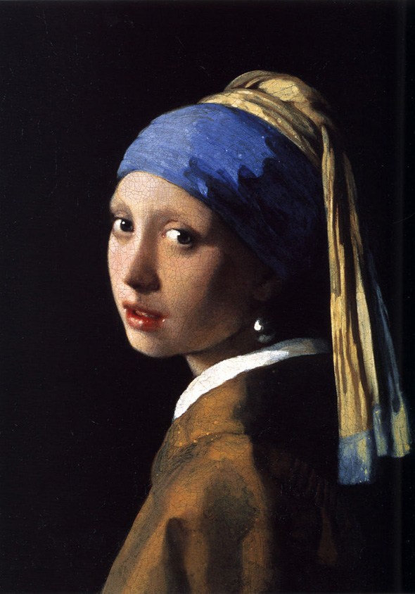
One famous classical painting is the girl with the pearl earring, painted by Johannes Vermeer in 1665, you can see that this is classical from different ratios used, such as the golden rule with the amount of black background on the left to the woman being about 1.6, and the pearl earring which stands out is about a third of the way from right so is also used the rule of thirds.
Below are more examples of classical work.
Hugely different from the girl with the pearl earring is Rain, steam and speed, by Joseph Mallard William Turner,this is a great example of an romanticism artist and piece of work due to it defying all the rules and typicality which is seen through classicism. The work is that of a steam engine and the oil paints used were really free flowing and is quite an abstract take on the scenery which it was intended to replicate because of the lack of details. Unlike classicism, this sticks to a very one sided colour scheme, which to me expresses a lot of a specific emotion.
Below are more examples of romantic/Gothic art styles
One famous classical painting is the girl with the pearl earring, painted by Johannes Vermeer in 1665, you can see that this is classical from different ratios used, such as the golden rule with the amount of black background on the left to the woman being about 1.6, and the pearl earring which stands out is about a third of the way from right so is also used the rule of thirds.
Ingres- Apotheosis of Homer
Jean Antoine- Two cousins
Louis Jean Francois Lagrenee - Mars and Venus
Hugely different from the girl with the pearl earring is Rain, steam and speed, by Joseph Mallard William Turner,this is a great example of an romanticism artist and piece of work due to it defying all the rules and typicality which is seen through classicism. The work is that of a steam engine and the oil paints used were really free flowing and is quite an abstract take on the scenery which it was intended to replicate because of the lack of details. Unlike classicism, this sticks to a very one sided colour scheme, which to me expresses a lot of a specific emotion.
Below are more examples of romantic/Gothic art styles
The wanderer above the sea of fog-Caspar David Friedrich
The Death of Sardana- Eugene Delacroix
The Raft of the Medusa- Georg Kaiser
Tuesday, 25 November 2014
Give some visual (art/design) examples of globalisation, Celebration/ rejection of brands companies
Banksy is an urban graffiti artist who uses satire and irony in his art work and often bases his work on consumerism and politics, some of his work is based of big corporations such as McDonalds and Disney, one of them being a young child polishing the clown shoes of McDonalds mascot Ronald McDonald, and another is that of a child being dragged away by Mickey Mouse and Ronald McDonald with a crying face whilst the corporations mascot maintain a happy disposition with a waving pose. This is suggesting that the corporations don't stand for what they mean and although they are targeted towards children, they are only established for money and will just take from them while keeping up a happy appearance for the media.
Bansky has other piece of art based upon globalisation and the way consumerism is an everyday aspect of life, one of which holds strong religious tones and is titled ' cross of consumerism', and features the significance of Jesus Christ being crucified but instead of nails hammered in his hands he is holding shopping bags and gifts, showing that he died not for our sins but for us to be petty over materialistic objects and we as a world have lost what was held dear in morals over time. It also lets audiences question what it is that we live and die for.
Friday, 21 November 2014
pick an old art piece and show how it has influenced newer work
Vik Muniz
The Mona Lisa- Leonardo da Vinci
Painted by da Vinci during the renaissance period, it is arguably one of the most famous and recognisable paintings in the world due to the technicality that when into the smile of the model. It is thought that over ten years of da Vincis life was spent working on this painting. However, by being such a masterpiece considered through out the world, it is only natural that other artists would use it as influence for their own work and styles, I will run through a few which stood out to me.
Banksy
Banksy is a huge name that stands out in urban graffiti, with his art plastering walls, pipes and other unusual canvases around countries, usually taking a satirical and ironical approach to politics using his art with deep and significant meanings.
This Banksy piece features the Mona Lisa and her iconic smile however she is holding a rocket launcher and a head piece, which is a great comparison to ignorant happiness while destroying other things.
Fernando Botero
Botero is an italian sculptor whom makes large and overweight models, his paintings are usual remakes of others except the models are vastly dis proportioned in weight and has even been self quoted in calling his work a gimmick just to be something new and different, being proud of the fact that when people think of bigger models in art his name may come to mind.
Vik Muniz
Titled ' Double Mona Lisa', this piece of art is made by Muniz by using food products of strawberry jam and peanut butter. This piece was very interesting to me due to the use of such simple and every day products that are generally overlooked being used to replicate a highly regarded master piece,
Subscribe to:
Posts (Atom)