Monday, 1 December 2014

classical and gothic/romantic art

The main difference between classical art and romantic/gothic art is that classic art is generally based on history, ideas and legends to be used as metaphors for stability and it's style places emphasis on symmetry, geometry quite often the architecture of ancient rome.Whereas on the other hand, Romantic art was generally more based on the emotion of the art in a sense, and at the time romanticists were seen as revolutionary in comparison to classicists, in terms of style romanticism is very free flowing and usually involves a lot of nature.


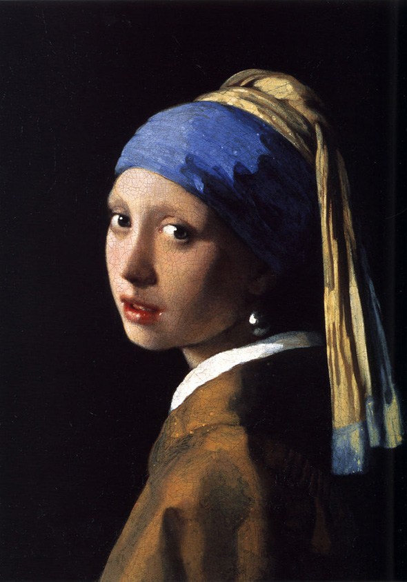
One famous classical painting is the girl with the pearl earring, painted by Johannes Vermeer in 1665, you can see that this is classical from different ratios used, such as the golden rule with the amount of black background on the left to the woman being about 1.6, and the pearl earring which stands out is about a third of the way from right so is also used the rule of thirds.


Below are more examples of classical work.


Ingres- Apotheosis of Homer


Jean Antoine- Two cousins


Louis Jean Francois Lagrenee - Mars and Venus

Hugely different from the girl with the pearl earring is Rain, steam and speed, by Joseph Mallard William Turner,this is a great example of an romanticism artist and piece of work due to it defying all the rules and typicality which is seen through classicism. The work is that of a steam engine and the oil paints used were really free flowing and is quite an abstract take on the scenery which it was intended to replicate because of the lack of details. Unlike classicism, this sticks to a very one sided colour scheme, which to me expresses a lot of a specific emotion.


Below are more examples of romantic/Gothic art styles


The wanderer above the sea of fog-Caspar David Friedrich


The Death of Sardana- Eugene Delacroix


The Raft of the Medusa- Georg Kaiser
Tuesday, 25 November 2014

Give some visual (art/design) examples of globalisation, Celebration/ rejection of brands companies


Banksy is an urban graffiti artist who uses satire and irony in his art work and often bases his work on consumerism and politics, some of his work is based of big corporations such as McDonalds and Disney, one of them being a young child polishing the clown shoes of McDonalds mascot Ronald McDonald, and another is that of a child being dragged away by Mickey Mouse and Ronald McDonald with a crying face whilst the corporations mascot maintain a happy disposition with a waving pose. This is suggesting that the corporations don't stand for what they mean and although they are targeted towards children, they are only established for money and will just take from them while keeping up a happy appearance for the media.


Bansky has other piece of art based upon globalisation and the way consumerism is an everyday aspect of life, one of which holds strong religious tones and is titled ' cross of consumerism', and features the significance of Jesus Christ being crucified but instead of nails hammered in his hands he is holding shopping bags and gifts, showing that he died not for our sins but for us to be petty over materialistic objects and we as a world have lost what was held dear in morals over time. It also lets audiences question what it is that we live and die for.


Friday, 21 November 2014

pick an old art piece and show how it has influenced newer work


Vik Muniz


The Mona Lisa- Leonardo da Vinci

Painted by da Vinci during the renaissance period, it is arguably one of the most famous and recognisable paintings in the world due to the technicality that when into the smile of the model. It is thought that over ten years of da Vincis life was spent working on this painting. However, by being such a masterpiece considered through out the world, it is only natural that other artists would use it as influence for their own work and styles, I will run through a few which stood out to me.


Banksy

Banksy is a huge name that stands out in urban graffiti, with his art plastering walls, pipes and other unusual canvases around countries, usually taking a satirical and ironical approach to politics using his art with deep and significant meanings.

This Banksy piece features the Mona Lisa and her iconic smile however she is holding a rocket launcher and a head piece, which is a great comparison to ignorant happiness while destroying other things.


Fernando Botero

Botero is an italian sculptor whom makes large and overweight models, his paintings are usual remakes of others except the models are vastly dis proportioned in weight and has even been self quoted in calling his work a gimmick just to be something new and different, being proud of the fact that when people think of bigger models in art his name may come to mind.


Vik Muniz

Titled ' Double Mona Lisa', this piece of art is made by Muniz by using food products of strawberry jam and peanut butter. This piece was very interesting to me due to the use of such simple and every day products that are generally overlooked being used to replicate a highly regarded master piece,


Salvador Dali and three pieces of his work


For this week we had looked at different surrealist artists and were asked to research three pieces of their work. I have chosen Salvador Dali, whom is one of the more well known surrealism artists.


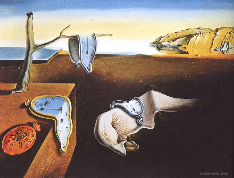
The persistence of memory.
the persistence of memory surreal art by salvador dali


Is probably Dali's most iconic painting, and is a favourite of mine due to the significance that melting time could have, allowing the audience to truly think and mull over the piece, as well as it being painted very well with a mysterious landscape and neutral colours.

To me the painting signifies that of a you aren't aware of how little time we have and how it goes away if used poorly and we have nothing to show for it, and it appears to have just melted away, and we will be at a point in our life unhappy and unable to change.

Which can be seen by the head of a middle aged looking man with his eyes closed in the dirt.


Skull optical illusion


skull optical illusion paintings by salvador dali

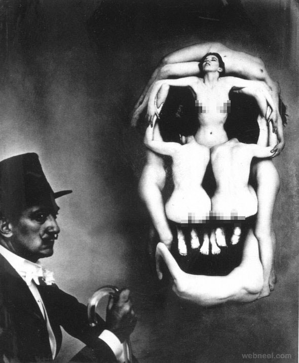
This is a photograph showing Salvador Dali and seven naked women models positioned in a manner to appear as a skull. Dali is shown looking away from the skull, which being made out of naked women probably signifies the temptation of  sexual desires and how he is above it by ignoring them.

The positioning of this photograph is unusual, due to Dali being in the third of a corner and the skull being used in the full half right side, instead of keeping to the rule of thirds idea or even golden section rule.

Skull of Zurbaran


skull of zurbaran illusion paintings by salvador dali

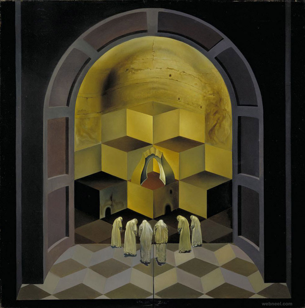
The Skull Of Zurburan is a very technical piece by Dali, focusing on the use of perspective which can be seen by the curves and shading used within the tilers and doors. The painting features six priests praying before a stack of cubes, which with lighting looks like a skull, and the title ' the skull of Zurburan' refers to Francisco Zurburan, whom was referred as one of the greatest 17th century painters and hailed for the way he achieved dramatic light affects in his work.

This piece stands out to me due to the optical illusion affect in which the top of a cube also looks like the bottom of another, and how it looks like it had been effortlessly painted to achieve this affect.

Evaluate an image of art/design where the influence come from future/past/present and visual cultures of art

This piece is by Richard Hamilton and is titled,'Just what is it that makes today's home so different, so appealing?'.


This collage was produced in 1956 and was made to represent everything that was an influence towards society at the time, it included a lot of political points such as the perfect housewife with an up to date and clean house with a maid hoovering, the moon was the roof because the space race was a huge international thing and it was a widely known thing that countries were challenging each other to get to the moon first in an attempt to prove whom had the best technologies. It also features a lot of art deco and pop art designs, showing a new wave of styles compared to earlier work.


Hamilton had mainly used American magazines as his sources of imagery, and even though he was a british artist the pictures in the collage was more relatable with everyone due to America being a huge media outlet even for Britain in the 1950's.

What I find makes the image very interesting is the use of both black and white images alongside the colourful backgrounds, which produces a high contrast and makes certain objects stand out more than others , such as the lollipop which the male body builder is holding sticks out much more due to being held by a black and white print photograph of a man.

Hamilton had made a collage relating to his older piece but with the same significance in 1992 as seen below.

Richard Hamilton ‘Just what is it that makes today’s homes so different?’, 1992
© The estate of Richard Hamilton

Find examples of signs, symbols, art etc that are iconic to the place you are from in Newcastle

My place in England is Newcastle upon Tyne as my child hood was mainly spent there, and the stereotypical themes of Newcastle is a party town, thanks to shows such as Geordie Shore advertising its clubs through the media of television. Another strong stereotype to come from Newcastle is football hooligans and the typical Geordie charm which comes hand in hand with the black and white football army.

One example of signs that has been used in Newcastle is that there was a trending motto from the alcohol company Stella Artois which was - it's a chalice not a glass, which had a poster positioned on a corner shop in Newcastle, and under that poster Newcastle brown ale had shown one saying- 'Who uses the word chalice? Newcastle Brown Ale. No Bollocks'.


Another famous moment was in 1998 when Newcastle fans had hoisted a giant Alan Shearer football shit over the iconic angel of the north. The angel of the north is a representation of Newcastle and is one of the most iconic landmarks in the region and is instantly recognisable with Newcastle and by putting a shirt of Shearer, who is hailed as one of the best nothen footballers, claims the icon to us even more and added that extra element of pride which Geordies tend to have with football and their hometown.


Tuesday, 28 October 2014

Choose and analyse examples of perspective used to convey deep space and openness, compared with confined space. How does perspective work on the visual perception and emotions?

There are numerous different types of perspectives which have been used and developed with in art forms, one of the most commonly used types of perspective is the vanishing point of an image, which is when all lines point towards a specific point of the image, this gives a more realistic and deep feeling towards the image.


Other well known types of perspectives are commonly used in films and the graphic designs of their posters. Examples of this are below.

Stenberg Brothers- The man with a moving camera


The way this image is composed of collages adds to the surrealistic affect, and the buildings all point towards a specific point add the feeling that the woman is falling and you're looking up from below her.

Focal point is when lines of different things in a piece of art line up to a specific point, in the art piece 'the last supper', Jesus is in the centre of the image and when you chart out the image it shows that all lines in people and columns in the architecture point towards Jesus.

Aniconism and It's Limitations in Art

The definition of aniconism is the shunning of images of divine beings, prophets or respected religious figures.

A well known piece of art which uses aniconism is piss Christ by Andres Serrano, which features an painting of Jesus Christ which is submerged in a tank of urine, Serrano tried to imply that it was a metaphor for how people 'piss' on him, using his name in vain in a blasphemous mannerism, however it wasn't perceived by the public that way. To the general audience it was the artist himself being blasphemous and someone later tried to smash the tank with a hammer, leaving a big indentation which is now part of the art work itself.


This bring the question forward, what is considered ok to be the focus of an artists art? The limitations changes within different eras, and a lot of what was seen to be risky at its time is now considered the norm, so what will be the new wave of avant garde and how long until that becomes the next norm and average that the general public will not batter an eye out?

Other uses on aniconism in art would be with in religious paintings of some cultures, as it considered immoral to humanise their gods and prophets within drawings, paintings and sculptures. This is more thought of in islamic cultures, and because of this a lot of statues over time has been ripped down from followers of the religion and are very strict in the beliefs.

More examples of aniconism are below.

The destruction of buddhist statues because they resembled a prophet or good, and the depiction of gods and prophets shown in human form wasn't allowed within the Islamic religion.


This was shown again through the Charlie Hebdo case in the news lately, where a french magazine depicted the prophet Mohammed in a way that upset the followers of Islam and some had retaliated with violent action and killing twelve people and injuring another eleven.

How specific cultures have influenced art through the ages

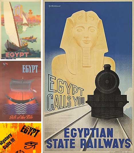
An example of how a culture has influenced art through the ages is the Egyptian culture, a main example of this is during the art deco period in the 1920's. Art was very influenced around the time of what was happening within the world, and a huge event which occured in the 1920's was the discovery of Tutankhamen's tomb containing his mummified remains. This was huge news at the time which quickly spread across the globe and what came to follow was a wave of Egyptian designed art deco pottery, posters, and for various other medias.


Architecture has also been influenced a lot by the Egyptians which can be seen in Skyscrapers and Houses, as they use a linear step design which was first seen from the Pyramids in the Egyptian era.


Japanese art had been influenced through the ages as it used to depict stories of farming and fighting for survival in battle, but as time went on, traditional japanese art reflected it and its style slowly changed alongside it, and when the east and west built transportation access and developed trade routes it allowed a bigger industry for Japan, changing the way it would view the world forever, and in a sense its traditional arts sources are not around to this present day, as no more do samurai fight and the loser commits suicide to regain honour.